How to Overlap Images in CSS

Something very popular in web design currently is overlapping images. When the design is handed to you, as the developer to implement it, there are a few ways to go about it like most things with CSS.
One way you might approach it is you could absolutely position one element with a lower z-index to make the other image sit on top, adjust the widths on each image, so you can see both of them and call it day, right?
Wellllll, once you need text or any other content after the images, you’ll run into a problem. If the absolute-positioned element is taller than the static (top) image, the following content will overlap the images. This is due to the height of the absolute-positioned image which is not recognized since it’s out of the document flow, (a normal behavior for an absolute positioned element). To get around this, you might begin to try out arbitrary heights on the images and the component then becomes very fragile, limited, and hacky real fast.
The next thing you know, you’re found days later with no food or water drinking the last of your uncontrollable tears. It’s a dark place, I don’t recommend it.
An example of what I’m talking about is here:
See the Pen image-stack-bad-example by Bri Camp (@brianacamp) on CodePen.
The good news: there is a much better way and do not attempt that first route unless you enjoy pain.
I will write out two solid approaches to overlapping images without having content overlap our wonderful image component I’ll affectionately call the “image stack”.
Method 1: CSS Grid
Before I start hearing grumbles about needing to support IE and how you can’t use CSS Grid, I say you can use CSS Grid and easily use a fall back for IE which I’ll show you how to do in the last section of this post.
One of my ding dang favorite things about CSS Grid (besides the fr unit, or the min-max property) is the ability to overlap images by varying z-indices without taking a thing out of the normal document flow!
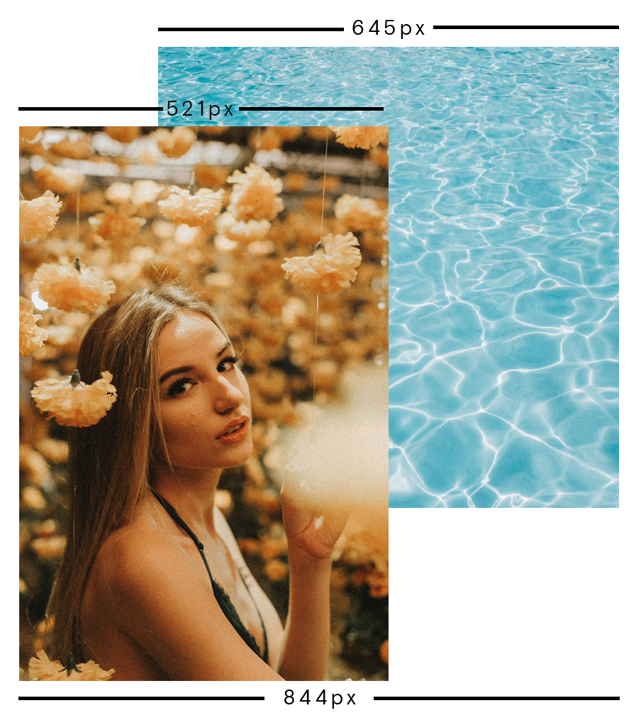
First we’re going to analyze this component:
A few things to note:
- The component will work regardless of any height of either top or bottom image. (Something to take into account when clients could upload any image via a CMS)
- The top image will always be a little pushed down from the top and will align with the left edge of the container.

The HTML Structure
   <div class="image-stack">
      <div class="image-stack__item image-stack__item--top">
        <img src="https://s3-us-west-2.amazonaws.com/s.cdpn.io/110238/texture-waves2.jpeg" alt="A portrait of a girl under hanging flowers.">
      </div>
      <div class="image-stack__item image-stack__item--bottom">
        <img src="https://s3-us-west-2.amazonaws.com/s.cdpn.io/110238/portrait-1-cropped.jpg" alt="">
      </div>
   </div>
Accessibility Tip: If you know the image is a decorative image (ex: image of the waves), and will not change you can add role="presentation" to the element and it will not be rendered to screenreaders.
Something we need to take into account is how the widths of the columns of the grid need to be. As mentioned before, you can approach this several ways, but I’m going to stick to using 12 columns since 12 column grids are used often.
In order to do that, on the parent element that contains the elements, in our CSS we’ll write:
  .image-stack {
    display: grid;
    grid-template-columns: repeat(12, 1fr);
    position: relative;
  }
grid-template-columns is a property that dictates how many columns the grid will have and the 1fr value is for the browser to calculate the available space. It comes in handy when you have column and row gaps. Hooray for browser calculations!
position: relative is imperative here: that’s what allows the z-index on the images to work as expected.
So now that we have our grid working, the next step is looking at the widths of the images:

To add our widths to each image based on the design, my mind works in percentages, so let’s start with the total width of the image component which is 844px, which equals 100%. The top image’s width is 521px. I divide 521px / 844px * 100 which equals 61.7%, round that up to 62% and you get a number that’s exactly in the middle of 7/12ths (58%) and 8/12 (66%) ha! Let’s go with 66%.
For our top image, we’ll write the following in CSS:
    .image-stack__item--top {
      grid-column: 1 / span 8;
      grid-row: 1; // must be on the same row as the other image
      padding-top: 20%; // this pushes the image down, and keeps it proportional as it resizes
      z-index: 1; // make this image render on top of the bottom
    }
For our second image, we’ll calculate (645px / 844) * 100 = 76.4%. We’ll round down to 75% which perfectly goes into our 12 column grid. 9/12ths. So, to do that, we’ll make sure our bottom image spans 9 columns and start it at the 4th grid line and span the entire rest of the grid which is what -1 does. You can think of -1 as the end if that helps!
Our bottom image CSS will look like this:
  .image-stack__item--bottom {
    grid-column: 4 / -1;
    grid-row: 1; // make this image be on the same row
  }
See the Pen overlapping-images-css-grid-example by Bri Camp (@brianacamp) on CodePen.
Et voila! With CSS grid and very little code you can start overlapping all the things that includes text over images, text over text (oh my!), images over canvas. You name it, the web is your oyster! Wee!
If you want to learn more about CSS grid I encourage you to familiarize yourself with the fantastic articles and videos from Rachel Andrews and Jen Simmons.
Method 2: Float with Negative Margins
So in the case that you have to support IE. Then this section is for you.
This method does require the ole “take the the dang element out of the document flow” tactic and we’ll be doing it with floats!
My friend and manager Jake Fentress came up with this solution which I applied to a recent client project since we needed to support IE11.
The good news is the structure doesn’t change a bit.
For the image-stack parent element we’ll add a clearfix since we’re floating its child elements and need the content to render below:
.image-stack::after {
  content: ' ';
  display: table;
  clear: both;
}
Then for the top image we’ll add:
.image-stack__item--top {
    float: left;
    width: 66%;
    margin-right: -100%;
    padding-top: 15%; // arbitrary
    position: relative;
    z-index: 1;
}
The negative margin here is imperative for this to work. Negative margins are REALLY weird. Depending if it’s a negative margin on the top or bottom, it’ll behave differently if you apply a negative margin to the left and right and they work differently on floated elements.
We’re applying a negative right margin on a floated left element that allows content to overlap. -100% is equal to the width of the container so it shifts the image to the left and allows the bottom image to render beneath it as if it’s not in the DOM.
Codepen here:
See the Pen overlapping images with float by Bri Camp (@brianacamp) on CodePen.
If you want more information over negative margins, I encourage you to read The Definitive Guide to Using Negative Margins. That article gives a deep dive into all of negative margin’s use cases and unexpected behaviors.
Fallback Solution (CSS Grid & Float Method)
This section will give you the best of both worlds, modern CSS for modern browsers and a fallback for IE11.
The most important part here is the @supports feature query. We’ll be using it to check if the browser supports the value of display: grid. We first put the IE or fallback CSS before we add the @supports feature query. Once we add the modern CSS, the floats will no longer be affected since grid is taking over. In the supports feature query, we’ll reset the width to 100% and you can either remove the float property or leave it be since it has no affect on the elements.
Here is the final codepen and example showcasing just that:
See the Pen Overlapping images with css grid and fallback by Bri Camp (@brianacamp) on CodePen.
I hope this article was helpful for you and accomplishes your layout dreams! Go forth and overlap all the things!
Be well!